4 Awesome Kitchens That Will Make You Want Brass
See how this trending finish holds up to a variety of cabinet colors and styles
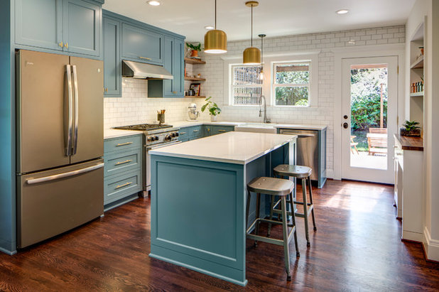
1. Brass on Blue
Designers: Marty Buckenmeyer of Buckenmeyer Architecture (architect) and Charlotte Cooney of Domestic Arts (interior designer)
Location: Portland, Oregon
Size: 195 square feet (18 square meters); 13 by 15 feet
Homeowners’ request. Update a dark 1970s kitchen to better reflect the traditional-style home but with a fresh point of view.
Brass. Brass pulls and pendants over the island bring warmth to the blue cabinets (Philipsburg Blue by Benjamin Moore).
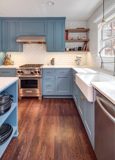
Other special features. Walnut wood shelves. Backsplash of handmade subway tile.
Designer secret. “Blue cabinets are more forgiving than white in terms of maintenance,” designer Charlotte Cooney says.
Backsplash tile: subway tile in milk glaze color, 3 by 6 inches, Bread and Butter Tile Co.; countertops: Caesarstone in Calacatta Nuvo, polished; lighting: Schoolhouse; wall paint: Cloud White, Benjamin Moore
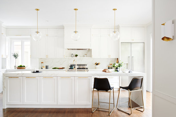
2. Brass on White
Designer: Kimberly Ayres
Location: San Francisco
Size: 340 square feet (32 square meters)
Homeowners’ request. As much cabinet storage as possible, an attractive place for appliances, a workhorse island, plenty of light and a stellar view.
Brass. Brass cabinet pulls, light fixtures and faucets. “We chose brass accents for a touch of a midcentury vibe, a favorite style of the homeowner, and for overall warmth,” designer Kimberly Ayres says. “Brass cabinet pulls and pendant lighting soften the island’s marble waterfall design.”
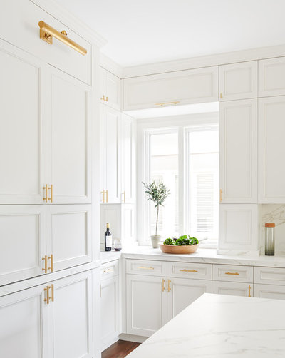
Other special features. The cabinets are painted in Benjamin Moore’s Gray Owl at 50 percent. “As much as we love natural marble, it simply wasn’t a good fit for this family, who worried about stains and maintenance,” Ayres says. “We chose Neolith [a porcelain material from Spain] for the island and perimeter countertops, and everyone is pleased.”
Designer secret. “This room has a nice ceiling height, so we divided the hanging upper cabinets into two rows,” Ayres says. “I used the golden ratio to work out door heights in order to create a perfect proportion.”
Cabinet pulls: Bar series, Lew’s Hardware; pendant lights: Schoolhouse; bar stools: CB2; sconces: Circa Lighting; cabinets: custom, Kenwood Cabinetry; countertops: Neolith in Calacatta, silk finish
3. More Brass on White
Designer: Amy Sullivan of Simplified Interiors
Location: Overland Park, Kansas
Size: 230 square feet (21 square meters); 23 by 10 feet
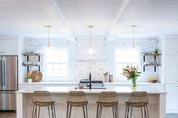
Homeowners’ request. A big kitchen with plenty of light and storage, and that feels open to the living area and backyard deck.
Brass. Brass pendant lights and cabinet hardware. “We added brass in ways that would not be expensive to change if the homeowner wanted to adjust with future trends,” designer Amy Sullivan says.

Designer secret. “We started with what could not change in the space — the ceiling beam on the left side that supported the house — and from there built a kitchen that was all about balance and light,” Sullivan says. The right beam is faux, and the French doors and two windows are new additions.”
“Uh-oh” moment. “When the counters were installed on this project, we had the installers leave the plastic film on them, as the space was still under construction and we wanted them protected,” Sullivan says. “The next week when we took the plastic off, we realized the color on the slabs was inconsistent. We later discovered that one section was from a different dye lot — they were quartz. It was disappointing to find such a big problem so close to the end of the project. After many conversations with the stone resource, they corrected the problem and reinstalled the countertops.”
Pendants: West Elm; bar stools: Cost Plus World Market; countertops: Silestone

4. Brass on Black
Designer: Federico Martin of IRP Designs
Location: Rye, New York
Homeowners’ request. A kitchen with a Los Angeles look.
Brass. Golden hand-brushed metal cabinet hardware, accents and custom hood. Brass pendant lights.
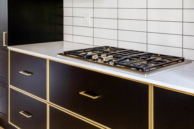
Other special features. Raw chestnut wood shelves. Backsplash is large-format subway tile in a stacked pattern with dark grout. Black matte lacquered cabinets. “The black lacquered matte with gold finish gives that L.A. vibe,” designer Federico Martin says.
Countertops: quartz in Absolute Blanc, Compac, The Surfaces Co.; bar stools: CB2
Tags: #AirdrieAlbertaHomesForSale, #AirdrieAlbertaLiving, #AirdrieAlbertaRealEstate, #AlbertaCanada, #AlbertaCanadaHomesForSale, #AlbertaCanadaLiving, #AlbertaCanadaRealEstate, #AltadoreAlberta, #AltadoreAlbertaHomesForSale, #AltadoreAlbertaLiving, #AltadoreAlbertaRealEstate, #CalgaryAlberta, #CalgaryAlbertaHomesForSale, #CalgaryAlbertaLiving, #CalgaryAlbertaRealEstate, #CalgaryRealEstate, #ChestemereAlberta, #ChestemereAlbertaHomesForSale, #ChestemereAlbertaLiving, #ChestemereAlbertaRealEstate, #HowardListedIt, #HowardListedItYYC, #HowardSoldIt, #HowardSoldItYYC, #HowardTeamYYC, #JustListedYYC, #JustSoldYYC, #ReMaxHouseofRealEstate, #TheHowardTeamCalgaryAlberta, #YYCHomes, #YYCLife, #YYCLifestyle, #YYCLiving, #YYCMarketWatch, #YYCRE, #YYCRealEstate, TheHowardTeam, yyc
