How To Lay A Brick Pathway
Thursday, February 28th, 2019
Always wanted a brick pathway?…Never sure how to get it quite right?… Well, now you do! Here’s a step by step guide showing you just how to lay your own beautiful brick pathway.

Always wanted a brick pathway?…Never sure how to get it quite right?… Well, now you do! Here’s a step by step guide showing you just how to lay your own beautiful brick pathway.
Tags: #AirdrieAlbertaHomesForSale, #AirdrieAlbertaLiving, #AirdrieAlbertaRealEstate, #AlbertaCanada, #AlbertaCanadaHomesForSale, #AlbertaCanadaLiving, #AlbertaCanadaRealEstate, #AltadoreAlberta, #AltadoreAlbertaHomesForSale, #AltadoreAlbertaLiving, #AltadoreAlbertaRealEstate, #CalgaryAlberta, #CalgaryAlbertaHomesForSale, #CalgaryAlbertaLiving, #CalgaryAlbertaRealEstate, #CalgaryRealEstate, #ChestemereAlberta, #ChestemereAlbertaHomesForSale, #ChestemereAlbertaLiving, #ChestemereAlbertaRealEstate, #HowardListedIt, #HowardListedItYYC, #HowardSoldIt, #HowardSoldItYYC, #HowardTeamYYC, #JustListedYYC, #JustSoldYYC, #ReMaxHouseofRealEstate, #TheHowardTeamCalgaryAlberta, #YYCHomes, #YYCLife, #YYCLifestyle, #YYCLiving, #YYCMarketWatch, #YYCRE, #YYCRealEstate, TheHowardTeam
Posted in Latest News | Comments Off on How To Lay A Brick Pathway

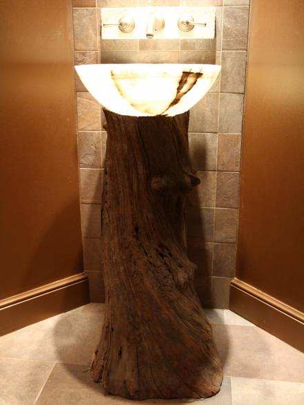
Why stick to the norm when you can put your bathroom sink on just about anything? Above were two of my favorites. Here are more inspiring alternatives for a traditional vanity.
Tags: #AirdrieAlbertaHomesForSale, #AirdrieAlbertaLiving, #AirdrieAlbertaRealEstate, #AlbertaCanada, #AlbertaCanadaHomesForSale, #AlbertaCanadaLiving, #AlbertaCanadaRealEstate, #AltadoreAlberta, #AltadoreAlbertaHomesForSale, #AltadoreAlbertaLiving, #AltadoreAlbertaRealEstate, #CalgaryAlberta, #CalgaryAlbertaHomesForSale, #CalgaryAlbertaLiving, #CalgaryAlbertaRealEstate, #CalgaryRealEstate, #ChestemereAlberta, #ChestemereAlbertaHomesForSale, #ChestemereAlbertaLiving, #ChestemereAlbertaRealEstate, #HowardListedIt, #HowardListedItYYC, #HowardSoldIt, #HowardSoldItYYC, #HowardTeamYYC, #JustListedYYC, #JustSoldYYC, #ReMaxHouseofRealEstate, #TheHowardTeamCalgaryAlberta, #YYCHomes, #YYCLife, #YYCLifestyle, #YYCLiving, #YYCMarketWatch, #YYCRE, #YYCRealEstate, TheHowardTeam
Posted in Latest News | Comments Off on 20 Inspiring Upcycled One of a Kind Bathroom Vanities

“Never put all your furniture against the walls,” says Karen Rauch Carter, feng shui consultant and author of Move Your Stuff, Change Your Life. “Furniture should be arranged to support communication, so forget where the walls are. Put at least the front legs of all furniture on the rug — not just around it — and people will sit there and talk.”

“Your kitchen is directly related to your ability to attract money,” says feng shui consultant Suzanne Metzger. Keep your pantry and refrigerator organized and full of fresh food you actually use. To attract more money, keep the stove clean — every burner must work and be used equally. Lastly, remove all clutter from the kitchen table.

“If you want to start a relationship, don’t surround yourself with single imagery”, says Laura Benko, feng shui and holistic design expert. “Avoid a single chair in the corner, solitary images in artwork and solo photographs. It’s important to create the energy of partnership around you, otherwise you are continually enforcing singularity.” Add a second chair to a sitting area, double up on nightstands and surround yourself with pairs of everything.

“Color has a powerful impact on mood, and red is considered auspicious and powerful. Think of walking the red carpet or wearing a red power tie,” explains Laura. Purple and green are also key colors for attracting prosperity but there’s a hitch. “If you really can’t stand the color green, it won’t work for you. But if you do love purple, paint a wall lavender or add a violet throw to your couch. Then tune in to how your space feels. It’s not just filling your home with stuff — it’s about decorating with mindfulness and enhancing the vibration and power of your own home.”

To improve your marriage, display smiling photos of yourself as a couple and your family in the hallways, kitchen or other high-traffic areas, suggests feng shui consultant Ken Lauher. Avoid putting family photos in the master bedroom, which should only include photos of the couple. Design by Cortney and Robert Novogratz.

If it’s hard to find your front door or it’s confusing as to how to get in, it’ll be hard for opportunity to make its way into your life as well, explains Karen. Put in an archway or gate to denote the front door if you need to, and make sure the doorbell works. The welcome mat should be bright and fresh. Sweep the steps and sidewalk in front, and add a potted plant to the entryway. Karen’s rule of thumb: “If a trick-or-treater can’t tell where to go, your front door isn’t clear enough.”

When it comes to creating more love, the dining room is the second most important space in a home, the master bedroom being the most important. Arrange the dining table so everyone can see each other, and set out enough chairs for everyone even if the family doesn’t eat together every night, says Karen. Symbolically, it’s important to include the whole group.

“To bring in more prosperity, it’s important to create a vibrant, healthy, inspiring and clutter-free home,” explains Laura. “Clutter jams up good energy and leads to procrastination. Bring in vibrant life forces such as plants and flowers, and don’t forget to have fresh air circulating. Fountains are important wealth adjustments in feng shui because they stimulate prosperity and energy, and symbolize money.”

Oversized master bedrooms need to be cozier in order to have good relationship feng shui. Start by closing off any adjoining rooms, including a bathroom, office, patio or gym, suggests Karen. If there’s no door, install curtains. If you have a sitting area, arrange the chairs toward each other, and downsize with a smaller bed — go from king to queen or queen to double. “When the space gets bigger and bigger, people tend to live further and further apart emotionally.”

“Feng shui applies to all the occupants in the house,” explains Laura. “Children can be even more susceptible to their surrounding energies, so it’s very important to make sure their beds are placed in the commanding position. They will feel easily startled and vulnerable if their backs are to the door.” Laura also says electronics should never be stored or charged near a child’s bed.

“Single people build rooms for single people,” says Karen. “They have one chair, one nightstand and so on. Add another nightstand for your future someone.” That goes for the closet too. “Don’t fill it up with your stuff — honor the space and carve out a dresser drawer or a shelf that’s not yours. You don’t need to literally have enough room for two people to live there, just leave room for opportunity.”

Sometimes it doesn’t take money to make money — just a yard sale. “This is a zero-cost fix,” explains Karen. “Take out clutter to increase prosperity; what you don’t use, don’t love, don’t need. Space equals opportunity.”

If your bedroom is too neat or stuck with a sterile feel, “add something whimsical that makes you smile,” suggests Suzanne. It could also be artwork or a photo of a couple laughing together. This can bring positive energy into the room, and in turn, improve the relationship.

“Drippy faucets are a sign of money going to waste,” Karen says. “Whatever the state of your water, your finances mirror those.” To increase your bank account, repair broken fountains and remove all stagnant water from your property. “Ever heard the expression, ‘I just can’t get my head above water’?” Karen asks. It’s best not to display water-based artwork or mirrors higher than your nose, which carries the same significance in feng shui. For most of us, that means no mirrors or water scenes above the bed.

“To decrease stress and arguing in your home, check your surroundings,” Laura suggests. “One couple that fought constantly had crisscross swords over their bed, and another couple had guns on their living room wall. Keep photos and artwork pleasing, inspiring and uplifting.”

“Many people who work from home have a lack of dedicated space for doing business,” says Karen. Take yourself and your business seriously if you want to attract new clients and bigger opportunities. Picture a CEO’s office, with a large desk facing the door and windows. “You’ve got to have space for people to come in, sit down and hand you a check. Putting a desk against a wall is a cubicle type position. It’s subservient, which is not assuming respect.” The amount of space in front of you relates to the amount of opportunities available, so arrange your chair so you have a view.

When it comes to the master bedroom, it’s not about the view or TV, explains Karen. “The bedroom is about passion and rejuvenation.” To increase intimacy in your home, install heavy, cozy drapes over large windows, remove the TV and never sleep with a laptop, iPhone or other electronics buzzing near your bed. The bedroom should be low-tech and romantic. Avoid pictures and decor featuring anyone other than the people sleeping there — wedding pictures work, but family photos don’t. Design by Cortney and Robert Novogratz

Because it’s the color of relationships in feng shui, pink is one of the best colors to decorate a bedroom with, says Ken. Pink represents love, joy, happiness and romance. It doesn’t need to be a whole room, even a splash will do. Alternatively, light blue is a positive relationship color.

Make sure your home speaks to you, or the feng shui updates won’t work. “The biggest feng shui money mistakes people make are choosing adjustments they don’t like,” explains Laura. “For example, red is considered a lucky color and you might hear that painting your door red will attract wealth. The bottom line is, if you don’t like red you will hate coming and going through it every day.”
Tags: #AirdrieAlbertaHomesForSale, #AirdrieAlbertaLiving, #AirdrieAlbertaRealEstate, #AlbertaCanada, #AlbertaCanadaHomesForSale, #AlbertaCanadaLiving, #AlbertaCanadaRealEstate, #AltadoreAlberta, #AltadoreAlbertaHomesForSale, #AltadoreAlbertaLiving, #AltadoreAlbertaRealEstate, #CalgaryAlberta, #CalgaryAlbertaHomesForSale, #CalgaryAlbertaLiving, #CalgaryAlbertaRealEstate, #CalgaryRealEstate, #ChestemereAlberta, #ChestemereAlbertaHomesForSale, #ChestemereAlbertaLiving, #ChestemereAlbertaRealEstate, #HowardListedIt, #HowardListedItYYC, #HowardSoldIt, #HowardSoldItYYC, #HowardTeamYYC, #JustListedYYC, #JustSoldYYC, #ReMaxHouseofRealEstate, #TheHowardTeamCalgaryAlberta, #YYCHomes, #YYCLife, #YYCLifestyle, #YYCLiving, #YYCMarketWatch, #YYCRE, #YYCRealEstate, TheHowardTeam
Posted in Latest News | Comments Off on 19 Beneficial Feng Shui Secrets
Tags: #AirdrieAlbertaHomesForSale, #AirdrieAlbertaLiving, #AirdrieAlbertaRealEstate, #AlbertaCanada, #AlbertaCanadaHomesForSale, #AlbertaCanadaLiving, #AlbertaCanadaRealEstate, #AltadoreAlberta, #AltadoreAlbertaHomesForSale, #AltadoreAlbertaLiving, #AltadoreAlbertaRealEstate, #CalgaryAlberta, #CalgaryAlbertaHomesForSale, #CalgaryAlbertaLiving, #CalgaryAlbertaRealEstate, #CalgaryRealEstate, #ChestemereAlberta, #ChestemereAlbertaHomesForSale, #ChestemereAlbertaLiving, #ChestemereAlbertaRealEstate, #HowardListedIt, #HowardListedItYYC, #HowardSoldIt, #HowardSoldItYYC, #HowardTeamYYC, #JustListedYYC, #JustSoldYYC, #ReMaxHouseofRealEstate, #TheHowardTeamCalgaryAlberta, #YYCHomes, #YYCLife, #YYCLifestyle, #YYCLiving, #YYCMarketWatch, #YYCRE, #YYCRealEstate, TheHowardTeam, yyc
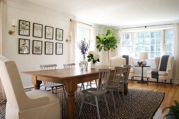
Posted in Latest News | Comments Off on Refresh Your Dining Room on a Budget

Color preferences vary as much as personalities, with some folks loving the bright and the bold, while others feeling most secure surrounded by neutrals. The good news is that when it comes to color, there really is no “correct” palette. That said, we’ve all been inside homes where an explosion of color created a choppy feel between rooms — and sometimes, the urge to run. We asked five color, paint and design experts to share their best tips for creating a cohesive flow of color throughout your home. The strategies vary, but any of them can help you come up with a holistic decor scheme for your entire residence. So choose the ones that work best for you.
Tags: #AirdrieAlbertaHomesForSale, #AirdrieAlbertaLiving, #AirdrieAlbertaRealEstate, #AlbertaCanada, #AlbertaCanadaHomesForSale, #AlbertaCanadaLiving, #AlbertaCanadaRealEstate, #AltadoreAlberta, #AltadoreAlbertaHomesForSale, #AltadoreAlbertaLiving, #AltadoreAlbertaRealEstate, #CalgaryAlberta, #CalgaryAlbertaHomesForSale, #CalgaryAlbertaLiving, #CalgaryAlbertaRealEstate, #CalgaryRealEstate, #ChestemereAlberta, #ChestemereAlbertaHomesForSale, #ChestemereAlbertaLiving, #ChestemereAlbertaRealEstate, #HowardListedIt, #HowardListedItYYC, #HowardSoldIt, #HowardSoldItYYC, #HowardTeamYYC, #JustListedYYC, #JustSoldYYC, #ReMaxHouseofRealEstate, #TheHowardTeamCalgaryAlberta, #YYCHomes, #YYCLife, #YYCLifestyle, #YYCLiving, #YYCMarketWatch, #YYCRE, #YYCRealEstate, TheHowardTeam, yyc
Posted in Latest News | Comments Off on Create A Cohesive Color Flow Throughout Your Home
How a couple of hands-on homeowners took a bungalow from dilapidated to delightful, using home-center finds.

It takes a certain eye to see a smart little cottage where others see a stucco teardown. But Steve and Shauna Mullins had exactly that vision when they first saw this 875-square-foot bungalow in Hermosa Beach, California.
“It was in a great location, less than a mile from the beach, and the basic layout was good—it hadn’t been screwed up,” Steve says. Still, the exterior of the 1941 house was showing its age, and its small rooms needed an update. Collaborating with architectural designer Rosa Velazquez on the front of the house, doing much of the work themselves, and enlisting a general contractor for the bigger projects, the couple lavished the tiny two-bedroom with a proud new facade and freshened the interior throughout.
For nearly all their redo needs, they jumped in the car and hit nearby home centers, scouring the aisles for well-priced shutters, fencing, cabinets, crown molding, paint, and more.
Removing the front wall’s stucco and putting up white fiber-cement lap siding refreshed the front face of the house. The other walls got a coat of white paint. Exposing the rafter tails, as well as topping the roof with new asphalt shingles, added welcome detail to the roofline. Relocating windows created symmetry and allowed room for shutters.
Building a deeper portico with chunky columns and crisp railing made the entry more welcoming. A bright red door with brass hardware, lantern-style sconces, salvaged brickwork, and a rose-entwined picket fence helped give the cottage a classic look.

Beige stucco and a nondescript entry gave the existing bungalow an institutional look, before.

Swapping in a new window, clean white Thermofoil cabinets, brushed-nickel pulls, and pale granite counters with an ogee edge made the kitchen brighter and more inviting. Ebony-stained crown molding and toekicks added sophisticated contrast. Stacked-to-the-ceiling pantry cabinets boost storage in the small kitchen.

The existing sad-sack galley dead-ended in a side-entry laundry area.


Adding crisp white crown and base molding gave the living areas a tailored, pulled-together look. For contrast, walls got a suede-finish neutral beige. Replacing windows with ones that have simulated divided lights added detail.

The original living areas were drab and disjointed, before.

Refinishing existing oak floors with a medium-brown stain unified the spaces. Paint gave new life to the fireplace, white on the wood and fire-resistant black on the brick surround.

Adding a deck with a pergola off the master bedroom extended the living space without altering the house’s footprint. The deck steps down to the drive, a grilling area, and a lawn set off by a picket fence echoing the front of the house.

The back of the house, where the bedrooms are located, had almost no connection to the outside, before.

Replacing a small window with French doors brought in air and light, making the 12-by-12-foot bedroom feel larger.
The second bedroom was strictly Motel 6. Adding beadboard wainscot gave the room (which became a nursery) its own identity while reinforcing the home’s cottage style. Painting the wainscot, trim, and furniture white helped keep the lilac scheme from seeming too sweet. Floor-length curtains, hung above the windows, help elongate them and make the ceilings feel loftier.

Swapping in a sectional door with raised panels and divided-light windows brought the garage up to par with the house. A blooming vine over the door softens the all-white facade. The flowering potato vine along the eves is trained on wires attached with eyescrews.

The freestanding garage had the blank, boxy look of a storage unit, before. Its tilt-and-raise door was sorely out of date.

The kitchen annexed a laundry area off the side door; the washer and dryer now fit behind cabinet doors. A wider opening and a half wall now connect the cook space to the dining area. French doors lead from the master bedroom to a new deck.
Tags: #AirdrieAlbertaHomesForSale, #AirdrieAlbertaLiving, #AirdrieAlbertaRealEstate, #AlbertaCanada, #AlbertaCanadaHomesForSale, #AlbertaCanadaLiving, #AlbertaCanadaRealEstate, #AltadoreAlberta, #AltadoreAlbertaHomesForSale, #AltadoreAlbertaLiving, #AltadoreAlbertaRealEstate, #CalgaryAlberta, #CalgaryAlbertaHomesForSale, #CalgaryAlbertaLiving, #CalgaryAlbertaRealEstate, #CalgaryRealEstate, #ChestemereAlberta, #ChestemereAlbertaHomesForSale, #ChestemereAlbertaLiving, #ChestemereAlbertaRealEstate, #HowardListedIt, #HowardListedItYYC, #HowardSoldIt, #HowardSoldItYYC, #HowardTeamYYC, #JustListedYYC, #JustSoldYYC, #ReMaxHouseofRealEstate, #TheHowardTeamCalgaryAlberta, #YYCHomes, #YYCLife, #YYCLifestyle, #YYCLiving, #YYCMarketWatch, #YYCRE, #YYCRealEstate, TheHowardTeam
Posted in Latest News | Comments Off on Home Upgrades That Pay

The laundry room has finally come into its own as a bright and organized cleanup command center, whether in a tidy corner of the basement or a nook next to the kitchen. For help updating yours, check out this expert advice on everything from energy-wise machines and thrifty flooring options to the best labor-saving layout and how to safeguard your home.
Tags: #AirdrieAlbertaHomesForSale, #AirdrieAlbertaLiving, #AirdrieAlbertaRealEstate, #AlbertaCanada, #AlbertaCanadaHomesForSale, #AlbertaCanadaLiving, #AlbertaCanadaRealEstate, #AltadoreAlberta, #AltadoreAlbertaHomesForSale, #AltadoreAlbertaLiving, #AltadoreAlbertaRealEstate, #CalgaryAlberta, #CalgaryAlbertaHomesForSale, #CalgaryAlbertaLiving, #CalgaryAlbertaRealEstate, #CalgaryRealEstate, #ChestemereAlberta, #ChestemereAlbertaHomesForSale, #ChestemereAlbertaLiving, #ChestemereAlbertaRealEstate, #HowardListedIt, #HowardListedItYYC, #HowardSoldIt, #HowardSoldItYYC, #HowardTeamYYC, #JustListedYYC, #JustSoldYYC, #ReMaxHouseofRealEstate, #TheHowardTeamCalgaryAlberta, #YYCHomes, #YYCLife, #YYCLifestyle, #YYCLiving, #YYCMarketWatch, #YYCRE, #YYCRealEstate, TheHowardTeam
Posted in Latest News | Comments Off on Design The Perfect Laundry Room




Tags: #AirdrieAlbertaHomesForSale, #AirdrieAlbertaLiving, #AirdrieAlbertaRealEstate, #AlbertaCanada, #AlbertaCanadaHomesForSale, #AlbertaCanadaLiving, #AlbertaCanadaRealEstate, #AltadoreAlberta, #AltadoreAlbertaHomesForSale, #AltadoreAlbertaLiving, #AltadoreAlbertaRealEstate, #CalgaryAlberta, #CalgaryAlbertaHomesForSale, #CalgaryAlbertaLiving, #CalgaryAlbertaRealEstate, #CalgaryRealEstate, #ChestemereAlberta, #ChestemereAlbertaHomesForSale, #ChestemereAlbertaLiving, #ChestemereAlbertaRealEstate, #HowardListedIt, #HowardListedItYYC, #HowardSoldIt, #HowardSoldItYYC, #HowardTeamYYC, #JustListedYYC, #JustSoldYYC, #ReMaxHouseofRealEstate, #TheHowardTeamCalgaryAlberta, #YYCHomes, #YYCLife, #YYCLifestyle, #YYCLiving, #YYCMarketWatch, #YYCRE, #YYCRealEstate, TheHowardTeam
Posted in Latest News | Comments Off on Your February Home Checklist

| The data included on this website is deemed to be reliable, but is not guaranteed to be accurate by the Calgary Real Estate Board |
|
||
| Trademarks used under license from CREA |
